There’s a growing feeling that’s becoming harder to ignore: many brands today seem cut from the same cloth.
This isn’t just a subjective perception. It’s a reality that becomes clear when you compare visual identities across very different sectors — fashion, tech, hospitality or physical products. Similar typefaces, neutral color palettes, clean compositions, and an aesthetic that aims to feel contemporary but often ends up interchangeable.
The question isn’t just why this is happening (which this article will also explore), but when we started to accept it as normal.
From identity to aesthetic
For years, brand design was about building recognizable identities, with distinctive elements that went beyond pure functionality. There was a clear intention to stand out.
Today, however, many brands seem to prioritize something else: fitting into a shared visual language.
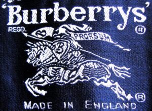
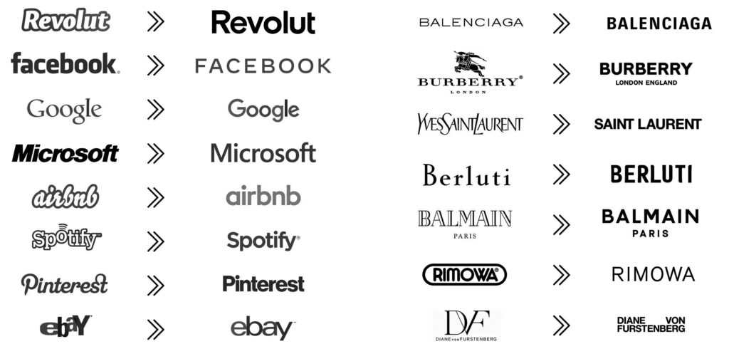
Rebrandings in the luxury sector are probably the clearest example. Brands like Burberry, Balenciaga or Yves Saint Laurent (now Saint Laurent) have simplified their logos into a very similar space: sans serif typography, black and white palettes, clean compositions, and little to no ornamentation.
This shift is partly driven by the need to adapt to digital environments. But it also raises a more uncomfortable question: to what extent has this simplification diluted brand character?
When companies with very different histories, values and positioning end up sharing the same visual code, identity stops being a differentiator and becomes a convention.
The result is a paradox: it has never been easier to build a visually correct brand — and never harder to make it memorable.
The culture of constant reference
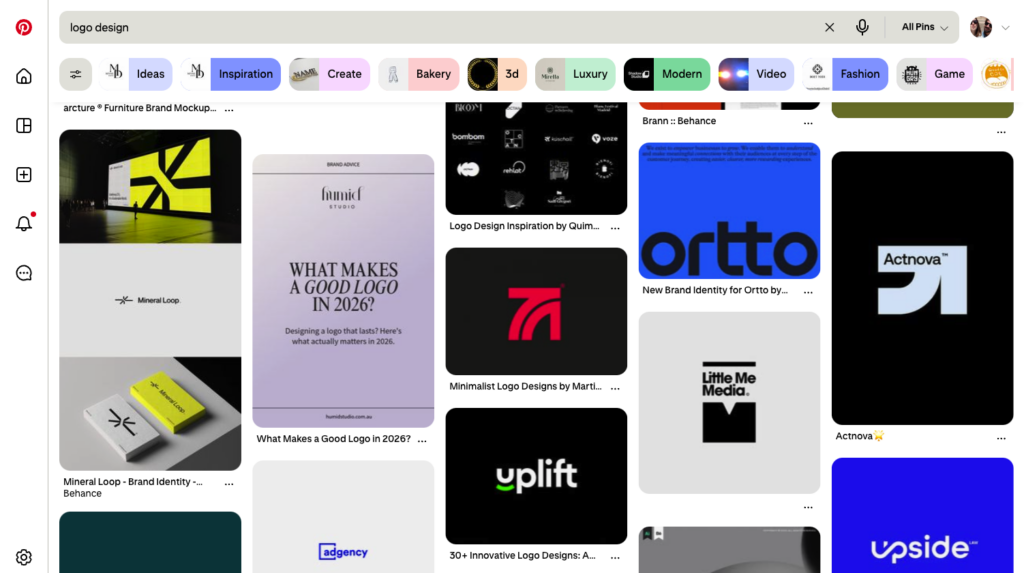
Part of this phenomenon can be explained by the context we work in. Platforms like Pinterest and Instagram have turned references into the starting point of almost every creative process. We save, organize and consume design continuously — and in itself, that’s not a bad thing.
The problem arises when reference stops being inspiration and becomes a limitation.
When everyone starts from the same visual sources, the room for differentiation shrinks. Not because of a lack of talent, but because the playing field is already conditioned from the beginning.
On top of that, there’s the role of the algorithm. What looks clean, aesthetic and easy to consume gets more visibility. And what gets more visibility gets replicated. It becomes a self-reinforcing loop that ultimately defines what we consider “good design”.
Tools that enable… and standardize
The rise of tools like Canva has had an undeniable impact. They’ve democratized design and allowed many smaller brands to communicate better.
But they’ve also helped establish a very specific visual language.
Templates, predefined systems, and “what works” combinations have created an ecosystem where many design decisions come prepackaged. This speeds things up, but also reduces exploration.
It’s not so much about the tool, but how it’s used. When the solution is too close, it’s easy to stop questioning it.
Safe design
Perhaps the most relevant point isn’t about trends or platforms, but about attitude.
Design today isn’t worse than in the past. In many ways, it’s more refined, more functional, and more adaptable. But it’s also, often, more cautious.
Brands avoid risk. They aim to please, not to challenge. And designers operate within that framework because we know it’s what the market validates.
This leads to a landscape where correctness outweighs personality.
Choosing again
In a context where everything starts to look the same, differentiation stops being an aesthetic decision and becomes a strategic one.
It’s not about rejecting trends or avoiding references. Nor about forcing originality for the sake of it. It’s about regaining judgment.
Knowing when a decision truly responds to the brand — and when it’s just following collective inertia. Having the ability — and the courage — to step slightly outside what’s expected.
Because in the end, the design that leaves a mark isn’t the one that fits best. It’s the one that has something to say.
Identidad Corporativa
Més enllà d’un logotip. Dissenyem identitats de marca sòlides que connecten amb la teva audiència.